The Detroit Rise Flag. People are putting thought into the symbols that represent their cities, states, nation. More than before there is movement in making sure what we put forth to the world to say, ‘This is who we are,’ accurately portrays us. A vital, exciting place to live should have a good flag.
Detroit is an old, industrial, Midwest town. And, it is a real renaissance city that is taking on new interesting vitality. Therefore, what about it’s flag?
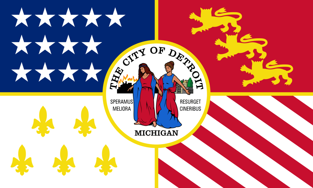
Designed in 1907 the current flag of Detroit has a ‘kitchen sink’ theme. Throw a little bit of everything onto a ‘white bedsheet’ and call it a flag. The French and English as well as the American influence are here. Then slap on the City Seal. (The Latin motto for Detroit translates as “We hope for better things’ – not exactly a progressive looking forward to great things saying.)
Enter a young talented graphic designer, who looked at the city flag and thought, …’We can do better than that.’ The current Detroit flag pretty much violates every rule of “Good Flag – Bad Flag” which are the guidelines all good Vexillologists follow.
The Detroit Rise Flag and it’s designer, Deon Mixon. On his website Deon explains the design elements that went into his proposed City of Detroit Flag. I did think his use of the ‘swoopy’ thing in the middle was an accurate representation of the Detroit River. I am a supporter of this redesign of the flag of the City of Detroit. See: detroitriseflag.com. The flag is available through: flags for good.com


Leave a comment