
An excellent example of the process of flag redesign: ‘The Peoples Milwaukee Flag’. Individuals decided that the flag of the city of Milwaukee needed a radical ‘do-over’. They went about designing a modern good flag for the city.
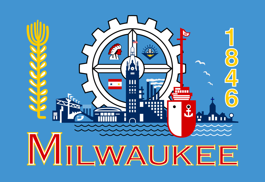
In 1954 the city adopted the city flag. They threw everything they could think of onto a ‘blue bedsheet’. Vexillologists rank this flag 147 out of 150. It fits almost all of the definitions of a ‘bad flag’. It is in sore need of a makeover.

People asked the city council to reconsider the flag so they held a contest. There were many entries none of which received much support. As is the case of much governmental action, nothing happened and no new flag was adopted.

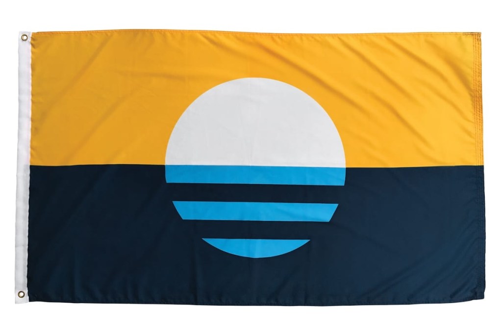
In 2016 a group decided on their own to design a new flag. They applied good flag design elements and came up with a fine flag. They ‘pulled a fast one’ and did not go to the city council for approval. Instead they released the design to the public domain and promoted it as “The Peoples Milwaukee Flag”. Businesses, even the Milwaukee Brewers Baseball Club, and the public loved the new design. Popular acceptance is exactly what they depended on.
The symbolism is rich and the design is good. The rising sun over Lake Michigan symbolizes a new day. The light blue bars in its reflection represent the city’s three rivers … and three founding towns … . Gold represents the brewing history and white symbolizes peace. So, has the city council approved it…that would be a hard “no”. To redesign a flag is not an easy matter. It has no weight, but I approve of The Peoples Flag of Milwaukee.

Leave a comment